Overview
HAZAYOT/LAB is a commerce site we built around a clear idea: every item is part of a whole world of material, clothing, and art. The site connects a shop, exhibitions, and a content journal under one visual language. Instead of stopping at a grid of products and prices, it makes room for photography, text, and curation. You can discover an item through the catalog, linger on its story, and continue to choosing and adding it to the cart. This is a project that connects brand thinking, interface design, and commerce flows in the same experience.
The challenge
The challenge was to give the brand a presence that feels like a gallery, while keeping the actions that make a shop usable. Large photographs and a minimalist language need to work alongside price, sizes, colors, and quantities. At the same time, the shop, the journal, and the exhibitions need to feel like parts of the same place, with clear navigation between them. The goal was to keep the brand's distinct character on every screen, and make the move from inspiration to choosing an item natural and clear.
The solution
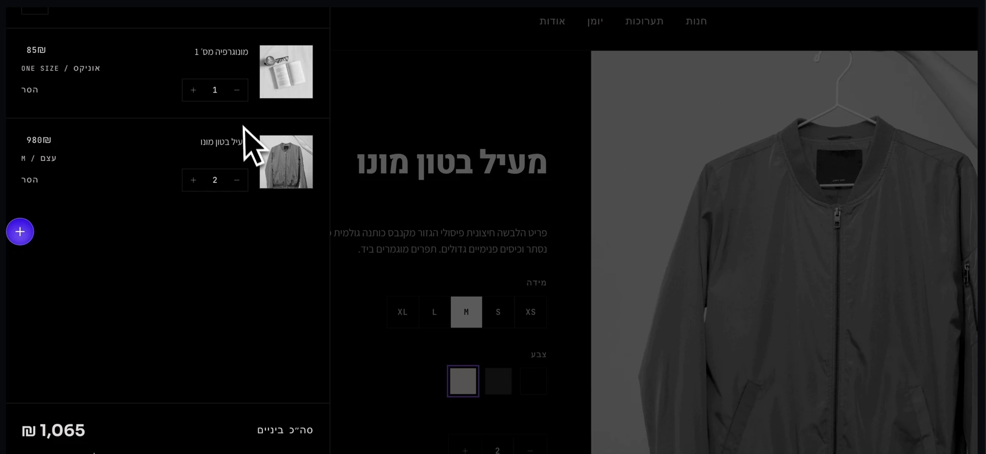
We built an experience that starts with a visual catalog and continues to product pages with a large photo, a description, and option selection. A side cart shows the items and the price summary without pulling the visit away from the product page. Alongside the shop, the journal and the exhibitions add context and ideas around the items. The design system rests on black and white, prominent typography, fine dividing lines, and purple accents. The same principles return in the catalog, the product, the cart, and the content, and create a clear sequence between discovery, depth, and action.
A catalog with a curatorial point of view
The catalog presents fashion, objects, and art in a wide photo grid, with names and item labels that give each item an identity. Choosing a department lets you focus within the selection. The design lets the photography lead, and keeps the information needed for orientation beside it. The catalog works both as a tool for choosing a product and as a window into the brand's visual world.
From the image to the chosen item
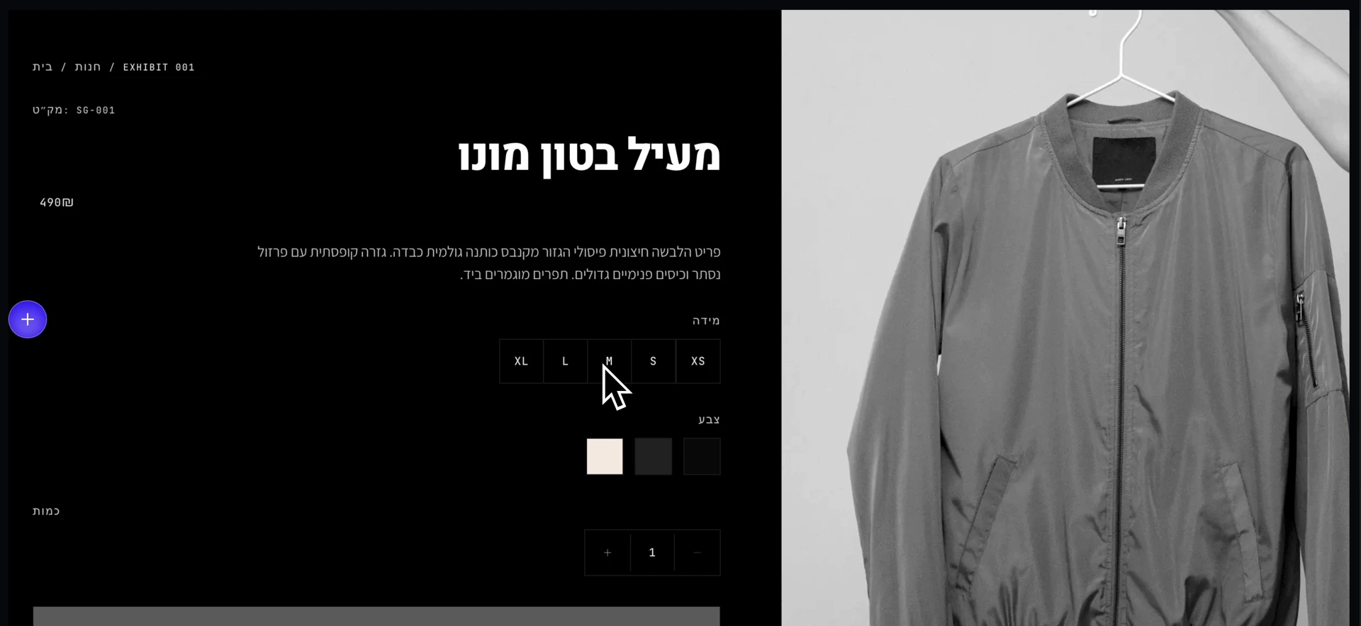
The product page connects a rich visual presentation with small, practical decisions: which size, which color, and how many units. The description, price, and selection options are gathered beside the image, with a clear mark of the selection. The side cart continues the same language and gathers the items, quantities, and the option to remove. The product context stays in view even while you check the cart.
Content that deepens the brand story
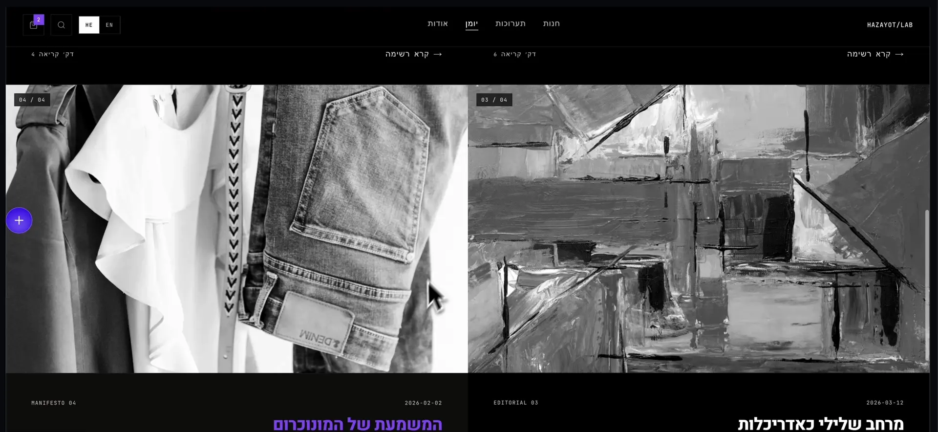
The journal presents articles through large photographs, headlines, dates, and reading times. It makes room for subjects such as monochrome, material, and architecture, and extends the visit beyond choosing an item. The content and the shop share the same design language, so the move between them feels continuous. The brand gets space to explain its point of view and build interest around the collection.
Exhibitions that connect story and catalog
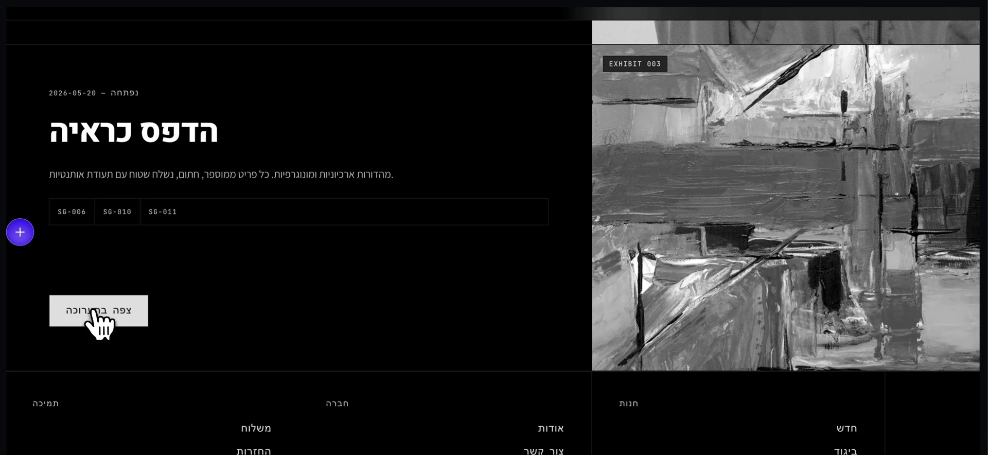
The exhibition pages present a work alongside curatorial text, item labels, and a link to the items related to it. The connection lets you meet the same world through story and image, and continue from there to the shop. It is another way to organize the content: by idea and context, alongside the department split. The result is a site that offers several paths of discovery inside one experience.
Results
The result is a commerce experience with a distinct identity: a catalog that invites discovery, product pages that help with choosing, a cart that gathers the decisions, and content that gives the items context. The video shows the transitions and the interactions on the site itself. For Unit 01, the project shows the ability to connect brand design with commerce interfaces and content: to build a site that has character, and to keep a clear hierarchy and defined actions all the way through.